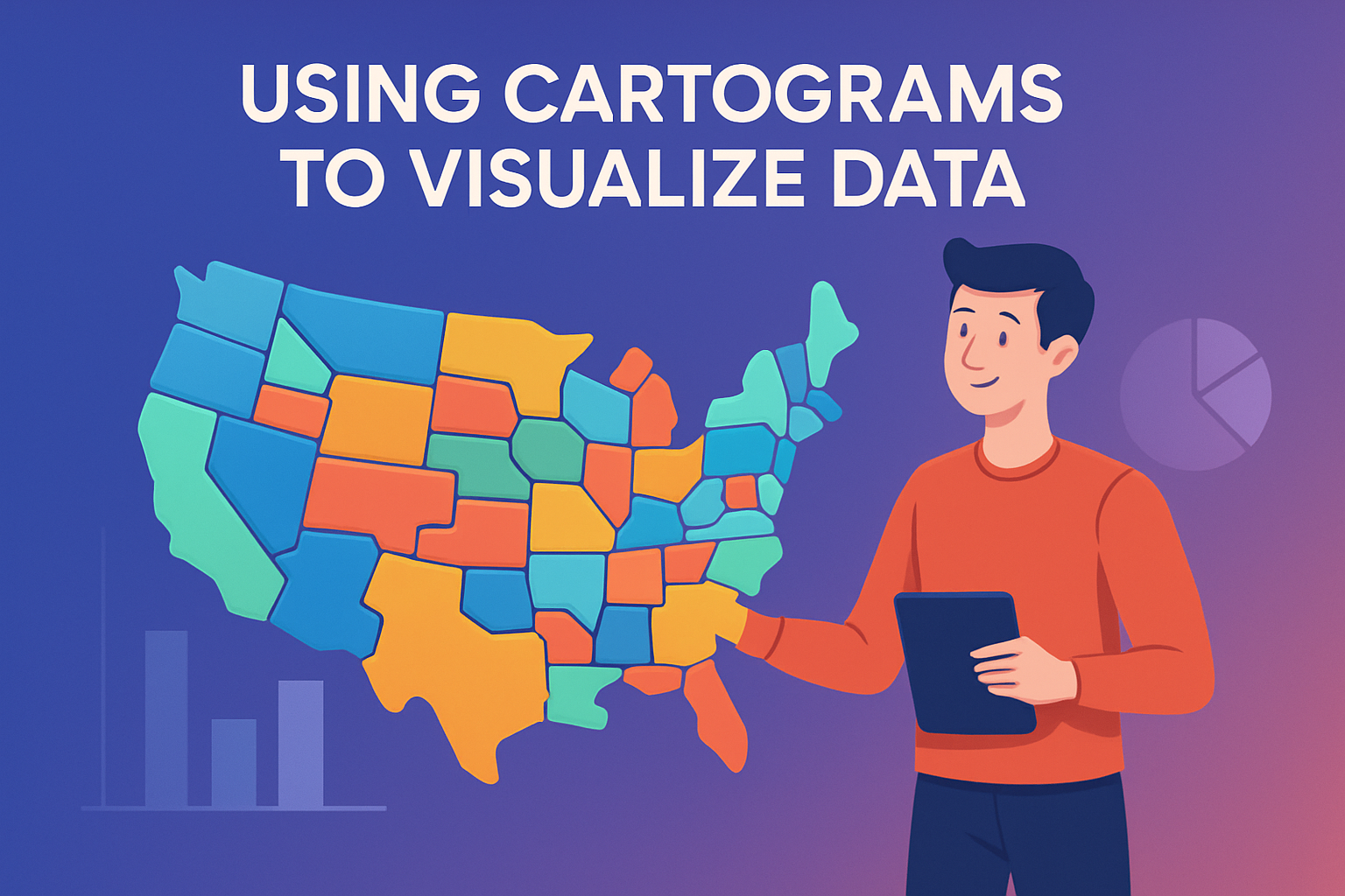
In today’s data-driven world, effective visualization tools are crucial for clarity and insight. Cartograms stand as a unique method in the realm of data visualization. Unlike traditional maps that rely on geographic accuracy, cartograms represent data by distorting geographic boundaries, offering an amplified view of spatial distributions according to a specific variable. This approach not only helps in understanding complex datasets but also provides fresh perspectives on familiar geographical landscapes. The significance of cartograms lies in their ability to narrate data stories, making it easier for decision-makers, educators, and the general public to comprehend intricate data patterns. In an era where geographical and statistical literacy is paramount, cartograms are powerful tools that transform raw data into intuitive insights, ultimately fostering informed decision-making across various fields.
The Mechanics of Cartograms
Cartograms work by altering the size of geographical entities, such as countries, states, or regions, based on a particular data metric. For instance, if we wanted to visualize the population density of different countries, a cartogram would scale each country not by its land area, but by its population size. This method transforms familiar shapes and layouts into visually informative distortions. There are primarily two types of cartograms: area cartograms and distance cartograms. Area cartograms, like the aforementioned population cartogram, adjust the sizes of regions to reflect the chosen variable. Distance cartograms, on the other hand, modify the distance between locations to show data such as travel time or accessibility.
One example of a cartogram’s application is in mapping electoral votes during U.S. presidential elections. Traditional maps might visually underrepresent heavily populated states like California or New York due to their geographic size. A cartogram, however, enlarges these states to showcase their electoral significance, offering a clearer picture of the electoral landscape.
Creating Cartograms: Methods and Tools
The creation of cartograms involves intricate algorithms and methods. One popular method is the Gastner-Newman algorithm, which ensures that areas correctly correspond to the data they represent while minimizing distortion. This algorithm is particularly useful for area cartograms. Various software tools, such as QGIS and D3.js, offer resources for creating interactive and static cartograms.
For example, a public health department might use cartograms to visualize the spread of a disease within different regions. By adjusting the size of each area based on the number of cases, healthcare professionals can pinpoint hotspots and allocate resources more effectively. Tools like QGIS allow for the import of shapefiles and custom data, enabling tailored cartogram creation that meets specific analytical needs.
- QGIS: Open-source geographic information system that supports cartogram creation.
- D3.js: JavaScript library for producing dynamic, interactive data visualizations, including cartograms.
- Carto: Platform for real-time location intelligence, allowing for data-driven cartogram visualizations.
Applications in Social and Political Analysis
Cartograms are invaluable in the social sciences, where demographic and socioeconomic data play a crucial role. For instance, a cartogram can effectively depict income disparity across different regions. By transforming areas based on average income or employment rates, analysts can visualize economic inequality and its geographic distribution.
Politically, cartograms serve as vital tools during elections. They can display voter turnout, election results, and campaign impact regionally. During the Brexit referendum, cartograms were used to illustrate the voting patterns across the United Kingdom, offering insights into regional disparities and political alignments. By visualizing electoral results in this manner, stakeholders can gain a deeper understanding of political dynamics and voter behavior.
Environmental and Climate Change Insights
Cartograms also play a pivotal role in environmental studies and climate change assessments. They can visualize data related to carbon emissions, deforestation rates, or the impact of climate policies. By focusing on areas with significant ecological changes, cartograms highlight regions that require urgent attention.
For example, a cartogram depicting global carbon emissions will proportionally distort countries based on their emission levels. Such a visualization makes it evident which nations are the largest polluters, thereby facilitating targeted climate action discussions and policy-making. This visual tool aids environmental organizations in advocating more effectively for global sustainability initiatives.
Challenges and Limitations of Cartograms
Despite the advantages, cartograms come with their set of challenges. One primary concern is the potential loss of geographic context. When areas are distorted to fit data metrics, spatial relationships can become less obvious, sometimes leading to misinterpretations. This requires careful analysis and supplemental information to ensure accurate understanding.
Additionally, creating precise and effective cartograms can be computationally intensive, demanding advanced algorithms and computing power, especially for large datasets. Moreover, not all datasets lend themselves well to cartogram representation. Variables with nuanced local differences may lose clarity when scaled to a broader level.
For example, cartograms depicting detailed local-level data, like neighborhood crime stats, might result in excessive distortion, reducing the clarity and interpretability of the information. It’s crucial for data scientists and analysts to evaluate the appropriateness of cartograms for their specific datasets beforehand.
Future Prospects and Developments
As technology advances, the potential for more sophisticated and detailed cartograms increases. New algorithms are continually being developed to address existing limitations, enhancing accuracy while retaining visual appeal. Additionally, the rise of artificial intelligence and machine learning offers promising avenues for automated and real-time cartogram generation, significantly broadening applications in various sectors.
For instance, urban planners might utilize AI-enhanced cartograms to predict population growth and urban sprawl, ensuring sustainable city development. Moreover, interactive and web-based cartograms are set to become more prominent, allowing users to explore and manipulate the data more dynamically. These technological advancements will play a crucial role in expanding the utility and accessibility of cartograms in data storytelling.
Conclusion: Embracing Cartograms in Data Visualization
Cartograms are powerful tools that redefine how we perceive and interact with geographical data. By distorting regions to align with specific data metrics, they reveal patterns and insights that traditional maps might obscure. While there are challenges associated with their use, the potential benefits outweigh the drawbacks, offering a unique lens through which to view complex datasets.
The key takeaway is that cartograms facilitate a deeper understanding of data, whether in electoral politics, environmental science, or socioeconomic policy. They invite viewers to reassess their perceptions, prompting informed discussions and decisions backed by data-led insights. For analysts, educators, and policy-makers alike, incorporating cartograms into their data visualization toolkit can be the next step in achieving more comprehensive and impactful storytelling.
If you’re looking to leverage cartograms for your datasets, consider exploring tools like QGIS, D3.js, or the Carto platform to start transforming your data into powerful visual stories.
Incorporating cartograms into your data visualization strategy opens the door to innovative insights and deeper understanding, helping to drive meaningful change through visually compelling data representation.
,750]
Frequently Asked Questions
1. What exactly is a cartogram and how does it differ from a traditional map?
A cartogram is a type of map used in data visualization where geographic space is transformed based on a variable other than spatial dimensions, such as population size or economic indicators. Traditional maps prioritize geographic accuracy to represent the Earth’s surface, showing political boundaries, physical features, and accurate distances. Cartograms, however, intentionally distort these geographic shapes to reflect data values, allowing users to visualize and analyze spatial distributions of a particular dataset. This distortion can result in some countries or regions appearing much larger or smaller than they actually are on a globe due to the data being represented. For example, if you’re looking at a cartogram of global GDP, a small but economically powerful country like Luxembourg might appear larger than a geographically expansive yet economically smaller country. This distortion creates a new visual language that gives prominence to data variables over exact geographic depiction, making complex datasets easier to understand at a glance.
2. How are cartograms used in data analysis and what are their main advantages?
Cartograms serve as an innovative tool in data analysis by transforming and simplifying the representation of complex data sets. One of their primary uses is to communicate data-driven insights through visual means, making them accessible to audiences who might not be familiar with the raw data itself. The main advantages of cartograms include the ability to quickly convey differences in data such as population density, electoral outcomes, or economic power relative to spatial areas on a map. They illuminate patterns and relationships in the data that might be difficult to detect using traditional charts or graphs. By highlighting the ‘weight’ or ‘importance’ of regions based on the chosen data variable, cartograms encourage viewers to rethink their pre-existing notions about the distribution of resources, social phenomena, or any numeric data related to geography. They are particularly useful for storytelling in media, policy-making, and educational contexts where understanding regional disparities or successes is critical.
3. What are the different types of cartograms, and when should each type be used?
There are several types of cartograms, each serving unique purposes based on the way they distort space and the kind of data being represented. The three main types are:
- Contiguous Cartograms: These maintain connections between adjacent regions, creating a map where all areas remain touching. While offering spatial continuity, they may significantly distort shape to accurately reflect data. They’re often used when maintaining the sense of connectivity across regions is important, such as in political maps representing voting outcomes where adjacent districts must be considered together.
- Non-contiguous Cartograms: These allow regions to separate and move apart from each other as needed to reflect data. They distort size but generally preserve shape, making them suitable when shape recognition is essential to the map reader, like when showing country data where the shape familiarity aids in comprehension.
- Dorling Cartograms: This type uses equally spaced circles whose sizes reflect the data being shown, with no concern for geographic proximity or relative positioning. Dorling cartograms are effective for displaying data like population or economic metrics on a map of a country or the world without the complexities of other cartogram styles.
Choosing a cartogram type depends on the balance between preserving recognizable features of the map and accurately representing the data’s geographical distribution.
4. What are some common challenges associated with creating and interpreting cartograms?
Creating and interpreting cartograms can present several challenges. For one, by their very nature, cartograms distort geographical boundaries, which can potentially confuse viewers who expect maps to represent geographic accuracy. This distortion can also lead to misinterpretations if the viewer is not familiar with the method used to adjust the map’s features. Additionally, if the data variable being mapped is volatile or rapidly changing, these transformations might require frequent updates to the cartogram, which can be labor-intensive. Another challenge lies in the risk of oversimplification; while cartograms make data visually accessible, they might reduce the detail or context needed for deeper analysis. Lastly, the technical aspect can be daunting, as producing cartograms requires specialized software and expertise in both cartographic principles and data science to ensure they are both accurate and meaningful. However, when done correctly, cartograms can overcome these challenges and offer a powerful way to visualize data.
5. What considerations should be made when designing a cartogram for a specific audience?
When designing a cartogram, it’s essential to consider the audience’s needs and context in which the cartogram will be used. First, understand the audience’s familiarity with both maps and the data topic in question. For a general audience, clarity and simplicity are key to ensure the message is immediately graspable. Educators, policymakers, and journalists, for instance, may prioritize comprehension and insight over geographic precision. Color choice is another crucial consideration; it should enhance readability and not distract from the data presentation. Labels and legends must be clear and concise, helping viewers navigate the distortions inherent in cartograms. It’s also important to provide context and explanations for the distortions to lower the entry barrier for audiences unfamiliar with this map type. Lastly, test the cartogram’s effectiveness by gathering feedback to refine how the data is presented and ensure the final product meets the informational needs of its intended audience, facilitating both engagement and understanding.